
GalleryPal.
Know More to See More
Introduction
Art should be for everyone. But when it comes to the in-person viewing experience at a museum or a gallery, many are left feeling isolated due to their limited knowledge of the subject matter. Once one learns more about the context and story behind the art, they naturally start to notice more elements that enhance their tour. So how can we help the audience know more to see more?
My role
GalleryPal wanted to design a solution designed as a mobile app or or a mobile-optimized website with a focus on improving the in-person viewing experience at a museum or a gallery. The process emulates that of the 5-day Google Ventures Design Sprint with the goal of creating a Minimum Viable Product (MVP).
Tools


Day 1: Research & Mapping
Research
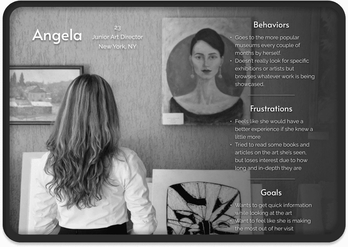
GalleryPal provided their own artifacts of user quotes, a persona, and an interview recording with an experienced museum tour guide. My first step as a designer was to review all of these research materials in order to elevate the starting ground.
Sometimes I’ll do a quick Google search for a painting while on my phone while at the museum…but I usually just find long articles that are super overwhelming.
”
“
I enjoy looking at art, but sometimes I feel like I’m missing out on the full experience by not knowing any background information or context.
There are so many times I find myself saying ‘how did the artist do that?!’ - I would love to know more about their process and technique.
”
“
I don’t need to know everything; I just don’t want to feel like I was missing out on something.

Mapping
In order to start ideating, I first mapped out the potential flow of the product. This simply involved putting myself in the viewer’s shoes and brainstorming about how flexible I’d want the experience to be.
Day 2: Demo & Sketching
Lightning Demo
The beginning of Day 2 consisted of looking at competitors who have tackled similar problem spaces. Many existing museums have curated their own apps, while other founders have created general archives of art to be searched & learned about.
Smartify
Google Arts & Culture
National Gallery of Art
Rijksmuseum Amsterdam
Sketching
Mapping on day 1 allowed me to naturally visualize how I might want the prototype screens to look like. The technique utilized for the sketch phase was Crazy 8s, where one creates 8 different sketches of a critical screen within 8 minutes. Naturally, I made these sketches for the screen showcasing the details of a singular artwork that the user would choose to learn more about.
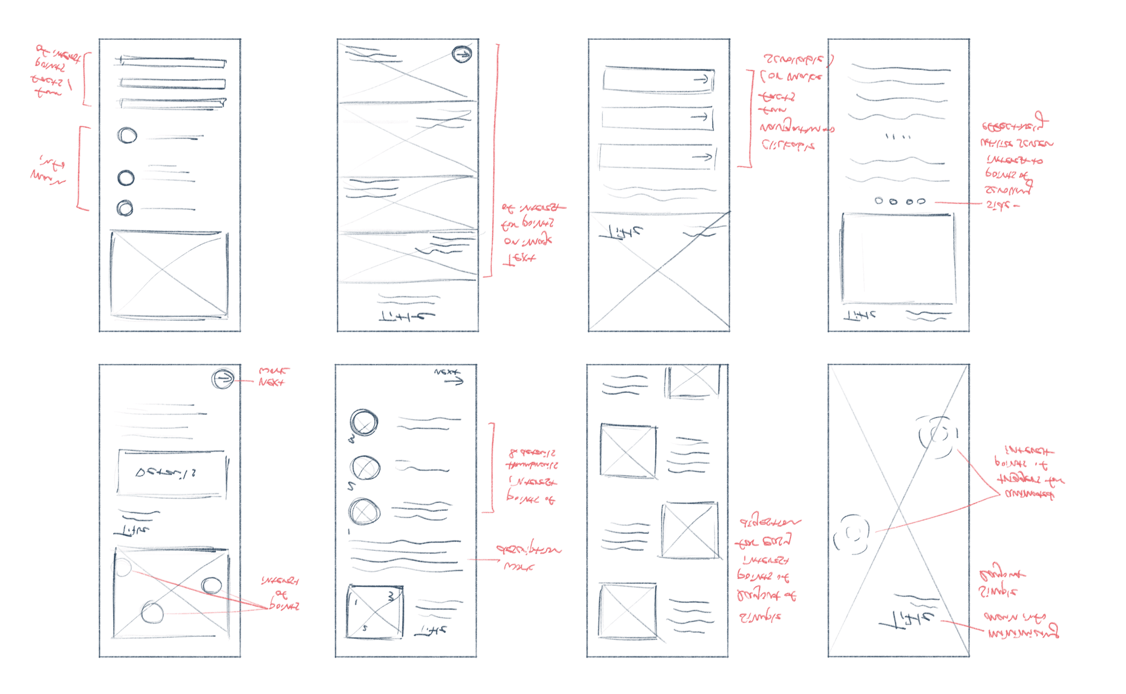

Solution sketch
After reviewing all the sketches, I decided on the first sketch with slight iterations. The thumbnail of the work would indicate “Points of Interest” that bring up a card when clicked on. Likewise, the artist name and the medium would be clickable navigation that feeds further information relating to the piece.
I additionally sketched the screens that would come before and after the critical screen, which are consequently the scan (by qr code or image) screen and the details (of the Points Of Interest) screen.
Day 3: Decision-Making
Storyboarding
Based on the sketches from Day 2, I created a storyboard of essential screens that will be incorporated into the prototype. They included the home page, search functions, profile page, and the detailed information pages for clickable navigation such as the artists’ names and the medium / technique labels.

Day 4: Prototyping
Design
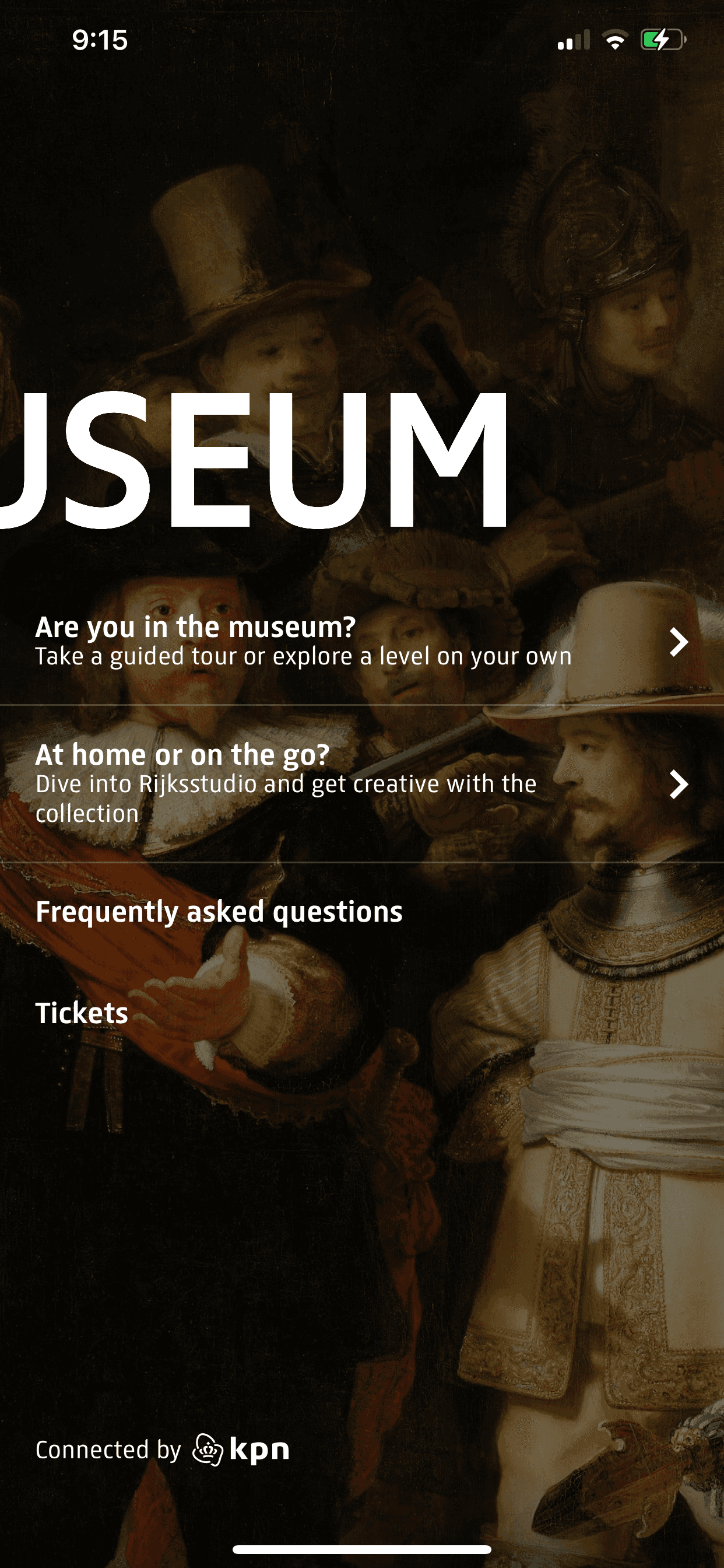
The fast-paced process introduced prototyping on Day 4. This meant that I had to simultaneously make branding decisions such as typography and color scheme. I settled on a grayscale color scheme that takes into account why most gallery walls are monochromatic - they provide a clean background for a calm and non-distracting viewing experience. Furthermore, the decision to lean into the “dark theme” was to prevent any harsh stimulation that could come from the combination of a pure white mobile background and heightened brightness settings.
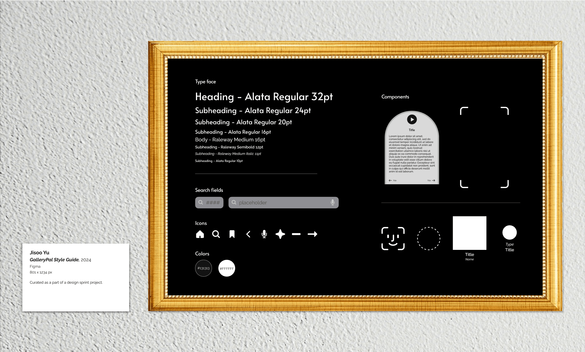
Prototype
For the actual prototyping process, I made it a priority to stay mindful about quick and digestible delivery. At the end of the day, we do not want the users to spend the majority of their time looking at our product while browsing the exhibition.
“I don’t really look for specific exhibitions or artists but browse whatever work is being showcased.”
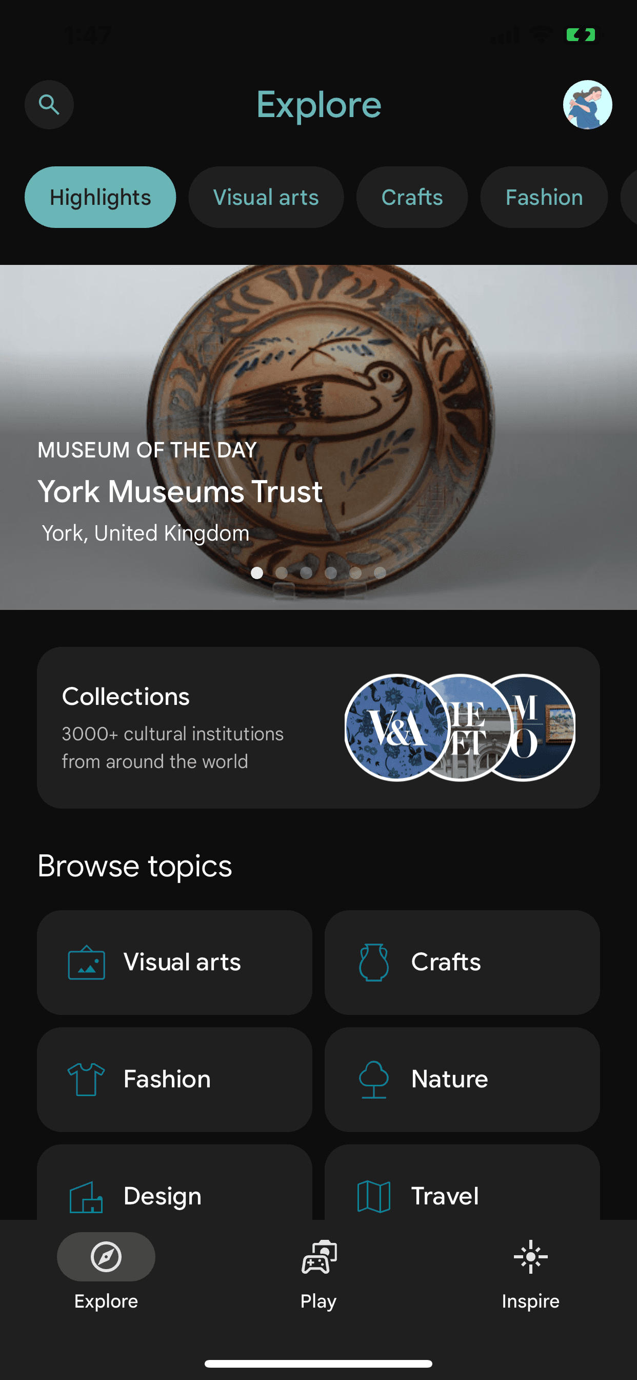
Scroll through the ongoing exhibitions within the home page. For those who come without a specific one in mind, they can see which one might catch their eye. For those who come for a specific exhibition, they can quickly navigate to the one they’re looking for while organically being exposed to more options that the location has to offer.
“Sometimes I feel like I’m missing out on the full experience by not knowing any background information or context.”
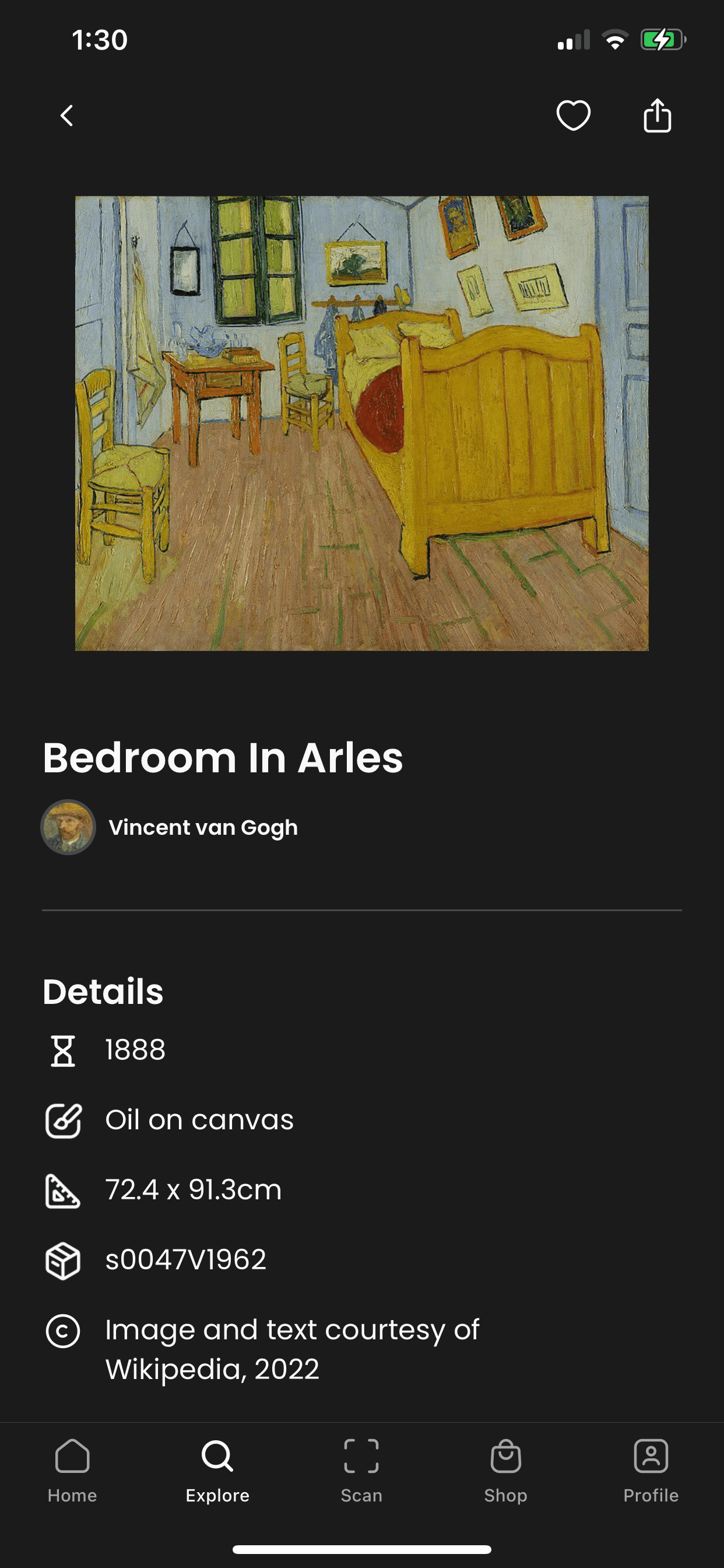
Click on the exhibition page to find out more the featured artists, work, and medium. The goal is to provide the multiple navigational pathways that the user can take without overwhelming them. The usage of thumbnails aids the user in making visual connections to the information they’re gathering.
“I always find a work of art that catches my eye that I didn’t read about beforehand.”
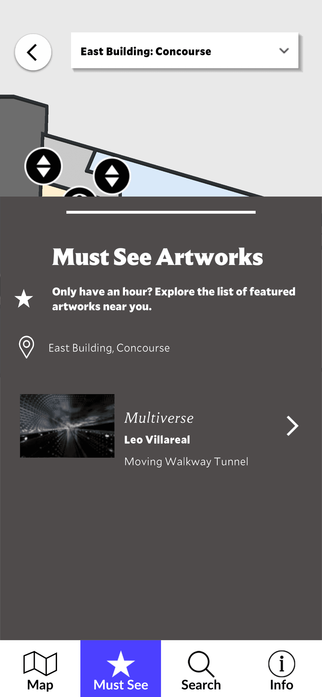
Swiftly look up the current artwork by searching its title, scanning the QR code, or typing the numerical code. The multiple search options allow for flexibility whether the user is up close or farther away from the work. It also allows them to look up artists, mediums, periods, etc.
“Sometimes I’ll do a quick Google search for a painting while on my phone while at the museum…but I usually just find long articles that are super overwhelming.”
“There are so many times I find myself saying ‘how did the artist do that?!’ - I would love to know more about their process and technique.”
Learn more about the piece by clicking on the Points of Interest. By dividing the piece into multiple elements, the individual lengths of text become more concise and digestible. The option of listening to an audio version also allows the user the focus on the in-person viewing experience while still having a clear idea about which part of the piece the information is referring to. They can easily navigate to the previous or next Point of Interest as well.

Day 5: Testing
Usability Testing
The last day of the sprint was scheduled for testing the MVP prototype. I asked the participants to share their first impressions of the product and its details, then dive into routing around the screens. The primary purpose was to test whether the users can easily learn more about artists, artwork, and other related elements on the fly. Overall, the feedback was pretty positive with minor suggestions on additional features.
“Navigation is quick & intuitive. Though the current version feels very ‘beta’, I can figure out what to do on which page.”
“The save feature is easy to understand, as it’s not cluttered by bunch of other icons nearby.”
“I want to see more when swiping through the home page! Maybe include upcoming exhibitions or popular works?”
“Since the thumbnails for the featured exhibitions are eye-catching, I’d love to be able to navigate to the specific artwork’s page right away.”
Conclusion
Learnings
Creating a useful product with a time constraint was a challenging but rewarding experience. It’s always fascinating to be reminded that sometimes a closed box allows for a greater expression of problem-solving skills rather than a completely open field.
Users were willing to utilize a secondary tool in gaining more knowledge during their gallery visit given that there is a low barrier for learning its usability.
Next Steps
GalleryPal has a lot of potential for further development. The current version primarily supports the experience of being at the exhibition already - so what if we ask the following questions moving forward?:
How might we help people look forward to upcoming exhibitions by sharing relevant but digestible information ahead of time?
How might we use the Save feature’s algorithm to suggest other artists or exhibitions without being obtrusive?
How might we make the product cross-functional with different galleries and museums across a wider region?
Special thanks to Great Art Explained (https://www.youtube.com/@GreatArtExplained) - my primary source for curating the art historic information within the prototype.